
Colour, Contrast and Confusion: How Paint Colour and Flooring Choices Can Support Independence for People Living with Dementia

Most homes in the UK are not equipped to handle ageing and dementia
Dementia in the UK is rising with the ageing population, and the number of people living with the condition is projected to reach 1.4 million by 2040 (Alzheimer's Society, 2025). Despite this, most homes have not been adapted to support the people living in them. The problem is that ordinary houses - with their existing layouts, colours and textures - are not designed with these changes in mind, and this can reduce quality of life for people living with dementia.
This is often made worse by flooring choices and finishes, particularly when pattern and texture cause confusion. Insufficient views to the outside and low levels of illumination can add further to the disorientation many people experience. As part of the wider housing crisis, this has become an urgent concern given the number of people affected. Below we detail a number of items for consideration to help create an environment that is easier to navigate for people living with dementia.
Dementia's Impact on Vision
Vision deteriorates as we age. With dementia, colour perception can change, along with sensitivity to colour. Reduced depth perception can make it harder to navigate through familiar surroundings.
Reds can fade into pinks, and blues and greens can become difficult to distinguish. Dementia can also remove the ability to cognitively override a misleading visual signal - a shadow or a dark rug, for example, can be read as a hole in the floor. This misread depth perception can leave people feeling anxious about moving around their own home.
Colour
With the right colours, patterns and carefully considered contrasts, designers can significantly improve how a space is perceived. Colour can be used strategically to support wayfinding and a sense of calm. Simple colour palettes are usually preferred. For example, earthy, neutral tones work well for walls and floors, with brighter pops of colour reserved for furniture and doors. Contrasting colours can also be used for handrails. In general, warm colours tend to enliven a space and encourage social interaction, while cooler tones create a calmer ambience.
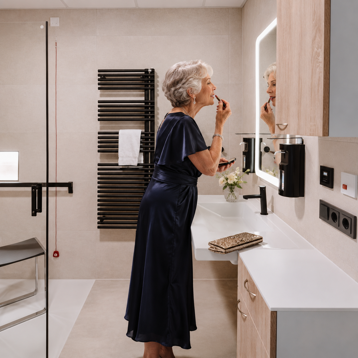
Good levels of contrast between fixtures and the surrounding walls and appliances will make a great impact on visual comfort. Original image courtesy of Keuko gmbh
Dark colours should be avoided on walls, as they reduce the overall illuminance of a space. Colour is especially important for creating clearly defined, contrasting paths that support wayfinding.
In larger buildings, signature colours can also be used to help residents find their way, depending on the setting. In care facilities, colour-coded floors can further improve the legibility of a space. Furniture here also needs contrast and can be a bright colour that stands out against walls and floors. Doors should similarly be a contrasting colour to the wall, while also contrasting with the door frame. Colourful artwork can also help stimulate people living with dementia and put them at ease.
Pattern
Busy patterns - stripes, linear patterns, high-contrast geometric or checked designs, and dense floral prints - can overwhelm the brain's processing capacity, leading to stress and anxiety. Even patterns that were once a person's favourites can work against them as dementia progresses. Patterns featuring dots or ornate detail should therefore be avoided.
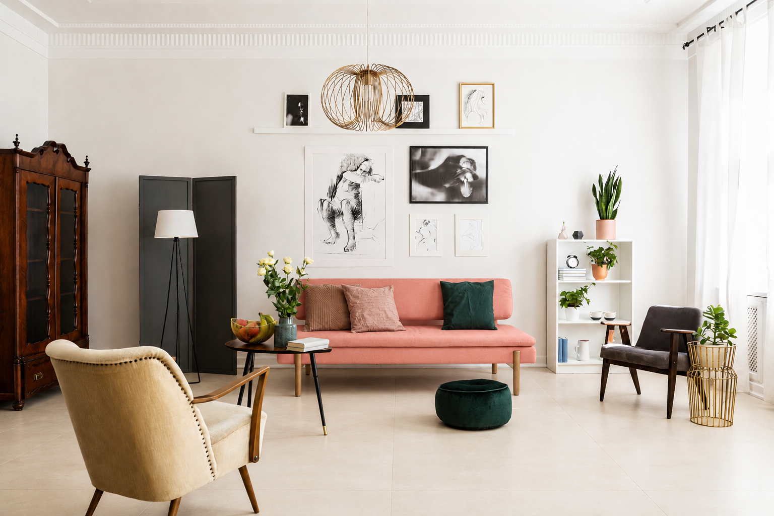
Interiors with minimal patterns on the floor and fabrics can create a more restful environment.
Bold patterns can also appear to move, altering spatial perception and causing visual disorientation that can lead to falls. Patterned or flecked floors can be difficult to read for this reason. Finishes such as terrazzo are best avoided, as is parquet flooring featuring herringbone or checkerboard patterns. Plain, single-colour flooring is best, as it creates a calming and predictable environment. The same principle applies to worktops.
LRV (Light Reflectance Value): A Tool for Understanding Colour Contrast
Light Reflectance Value, or LRV, is a tool used in design to measure how much light a surface reflects. It indicates the percentage of visible light a surface reflects when illuminated by a light source, on a scale from 0 (pure black) to 100 (pure white). Two very different hues can share the same LRV, while two shades of the same colour can have very different LRVs.
LRV values can be used in specifying contrast between items where easy identification is improved by greater contrasts.
As an example of where this should be practically applied, toilet seats can be a contrasting colour to the wall and floor, and stair nosings should also be given a contrasting colour to aid perception of the stair rise and going. Matte, non-glossy tiles are preferable to glossy ones, as they reduce glare that can confuse light-sensitive eyes.
Floor finishes should have a minimum LRV contrast of 30 points against the walls. When moving between different flooring types from one room to another, however, the contrast should be much closer - ideally within 8 to 10 points.
Doors should also provide sufficient tonal contrast against the surrounding walls, making them easier to identify and use. The same principle applies to handrails and grab rails, which should have a clear contrast against the wall behind them to ensure they are easily visible. In accessible bathrooms, for example, contrasting grab rails can help users quickly identify where support is available.
Threshold strips should generally have minimal tonal contrast with adjoining floor surfaces. Ideally, adjoining level floor surfaces should be within 8 LRV points of each other, with a maximum difference of 10 points, to avoid creating the visual impression of an obstacle.
In care settings, landmarks such as plants and furniture can support wayfinding, and are often more effective than signage. Where signage is required, it should be clear and placed slightly lower than normal.
Aiding Reminiscence
When it comes to boosting mood it is important to reinforce positive memories. Old photographs can help tap into well-preserved long-term memories, and digital photo frames are also a good way to support this practice.
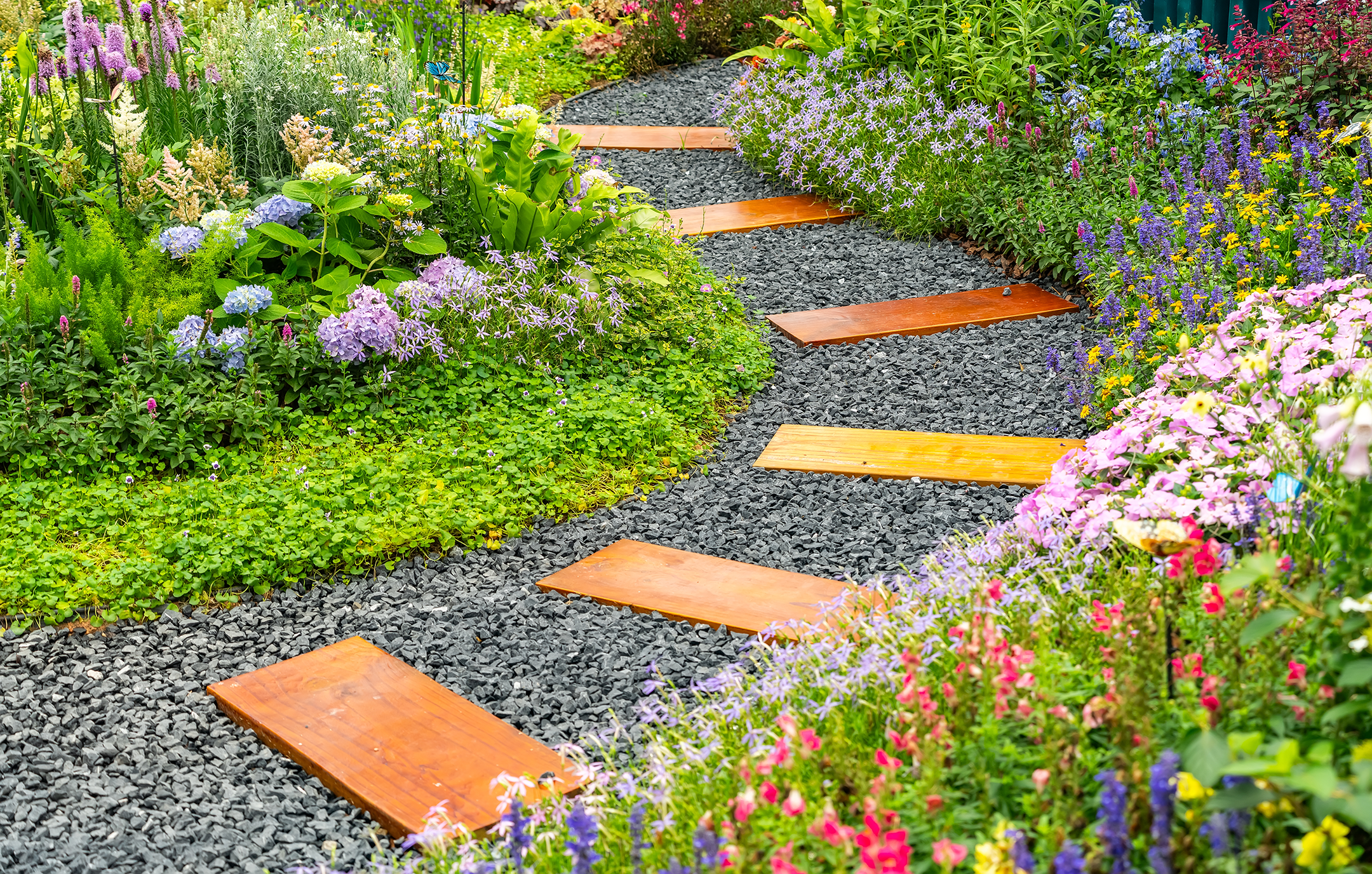
Outdoor spaces with clearly marked paths can have many benefits including a reduction in stress levels.
Conclusion
For a person living with dementia, colour and contrast are more than aesthetic choices - they are part of a strategy that allows someone to read a room correctly and continue functioning independently, whether at home or in a care setting. By staying sensitive to light levels and avoiding bold patterns, designers can choose the right furniture, wallpaper and floor finishes to create a dementia-friendly space that supports independence.
If consideration to these items is taken together, it can help create a calming, legible environment that removes daily friction, helps people continue to do things for themselves, reduces the risk of falls and supports a better quality of life.
References
Alzheimer's Society (2025) How many people have dementia in the UK? Available at: https://www.alzheimers.org.uk/blog/how-many-people-have-dementia-uk (Accessed: 11 August 2026).
Dementia Services Development Centre, University of Stirling (no date) Your dementia design toolkit: Light reflectance values (LRVs). Available at: https://www.dementia.stir.ac.uk/newsblog/dementia-design-toolkit-lrvs (Accessed: 11 August 2026).
Kirklees Council (2022) Dementia Friendly Design Tool. Available at: https://www.kirklees.gov.uk/beta/health-and-well-being/pdf/us/en/